12 Brands With Out Of The Box Packaging!
In the world of packaging, where creativity knows no bounds and first impressions are the last impressions, in today’s consumer-driven market, packaging plays a pivotal role in capturing attention, sparking curiosity, and establishing a unique brand identity. Gone are the days of conventional boxes and bland wrappers; disruptive and cool brands have taken the stage, pushing boundaries and reimagining packaging as an art form. Join us as we dive into a captivating journey, exploring the realm of quirky packaging and uncovering a selection of brands that have embraced the power of disruption to deliver unforgettable experiences. Get ready to be inspired by the innovative, the unexpected, and the truly extraordinary.
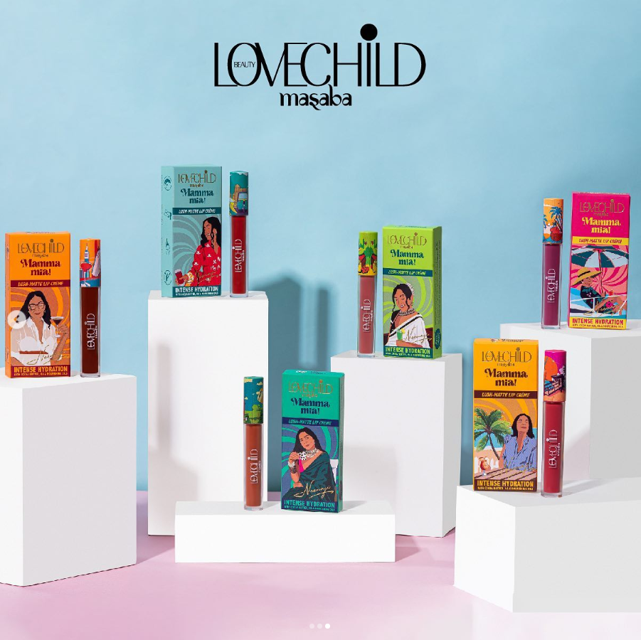
LoveChild is changing the beauty game with its amazing brand that celebrates women of all ages, skin tones, and personalities, making them feel confident in their own unique beauty. What makes LoveChild truly special is its eye-catching packaging that is absolutely stunning! The packaging is full of fun and quirky details like solitaire, Jenga, board games, and nostalgic orange candies that bring back happy memories. The font used adds an extra touch of brilliance, combining English and Hindi to appeal to a wide range of people. Millennials are going to love LoveChild’s innovative products and the packaging revolution it brings. Get ready to be wowed by LoveChild’s incredible packaging as it leads the way in transforming the beauty industry and empowering women to embrace their individuality.
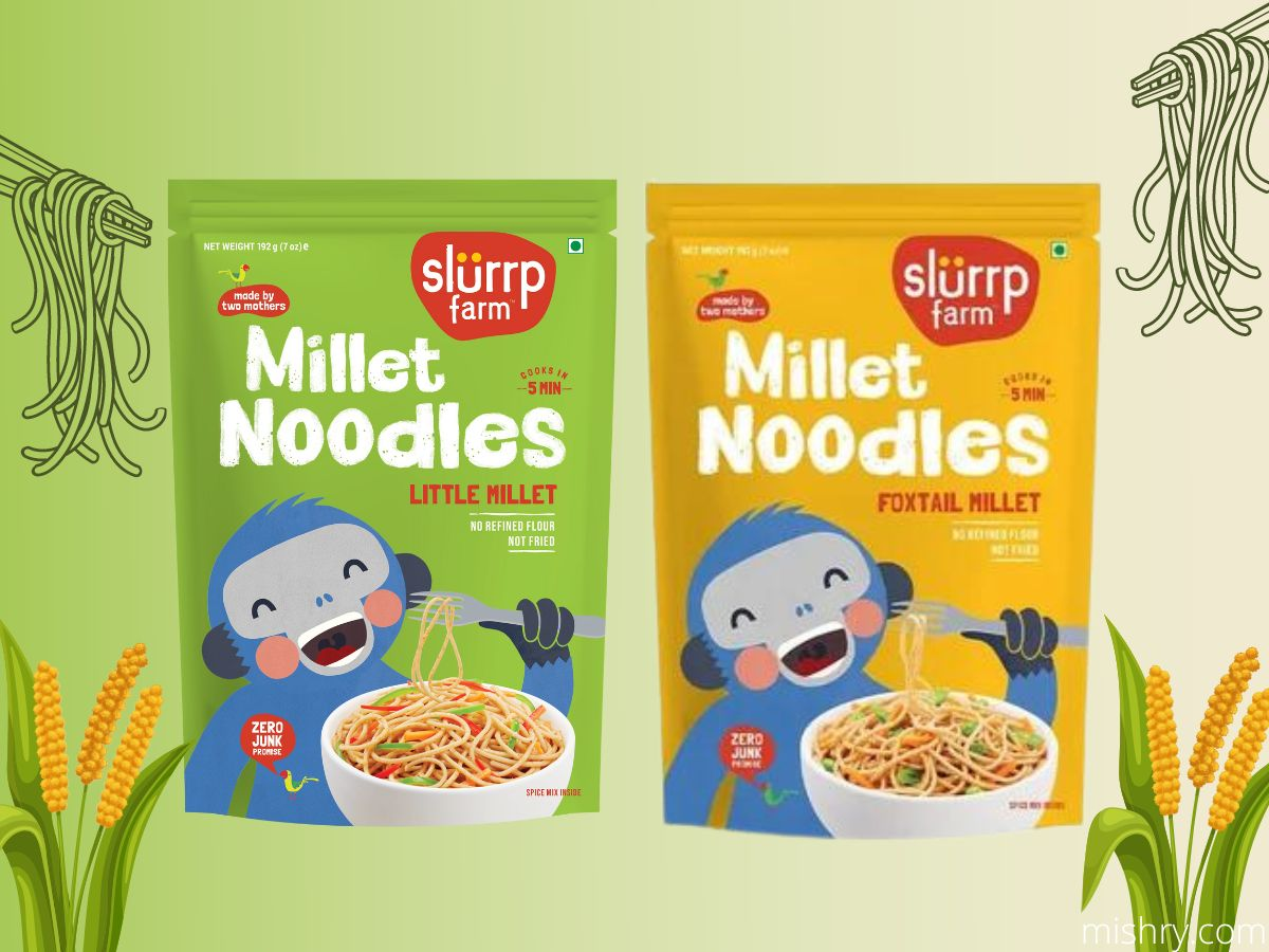
Slurrp Farm’s packaging design is a clever and fun way to promote healthier food options to children. Their packaging features animals as chefs and colorful illustrations that catch kids’ attention. The clear language on the packaging makes it easy for parents to choose the products they want. The playful illustrations and quirky design elements make the packaging appealing to children and encourage them to try healthier foods. By using animals as chefs and showcasing ingredients like bananas and chocolates, Slurrp Farm creates a connection between fun foods and healthier options. For example, they feature a tiger chef with banana pancakes to make healthy pancakes more appealing. Overall, Slurrp Farm’s packaging is smart and effective, making their products stand out and appealing to both parents and kids.
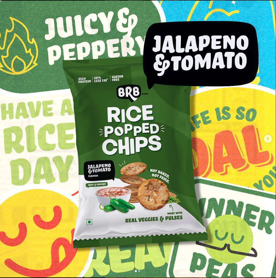
Brb Chips has quirky and colorful packaging that stands out on store shelves. The brand uses emojis to show the flavors of their popped chips, creating a visual connection between the chips and the emotions they might evoke. The packaging highlights that the chips are popped, not fried or baked, positioning them as a healthier option. This clever packaging design appeals to a wide range of consumers by offering a fun and enjoyable snack. It also appeals to health-conscious individuals with its clear messaging about the health benefits. With vibrant colors and playful illustrations, Brb Chips’ packaging is eye-catching and perfect for anyone seeking a tasty and unique snack.
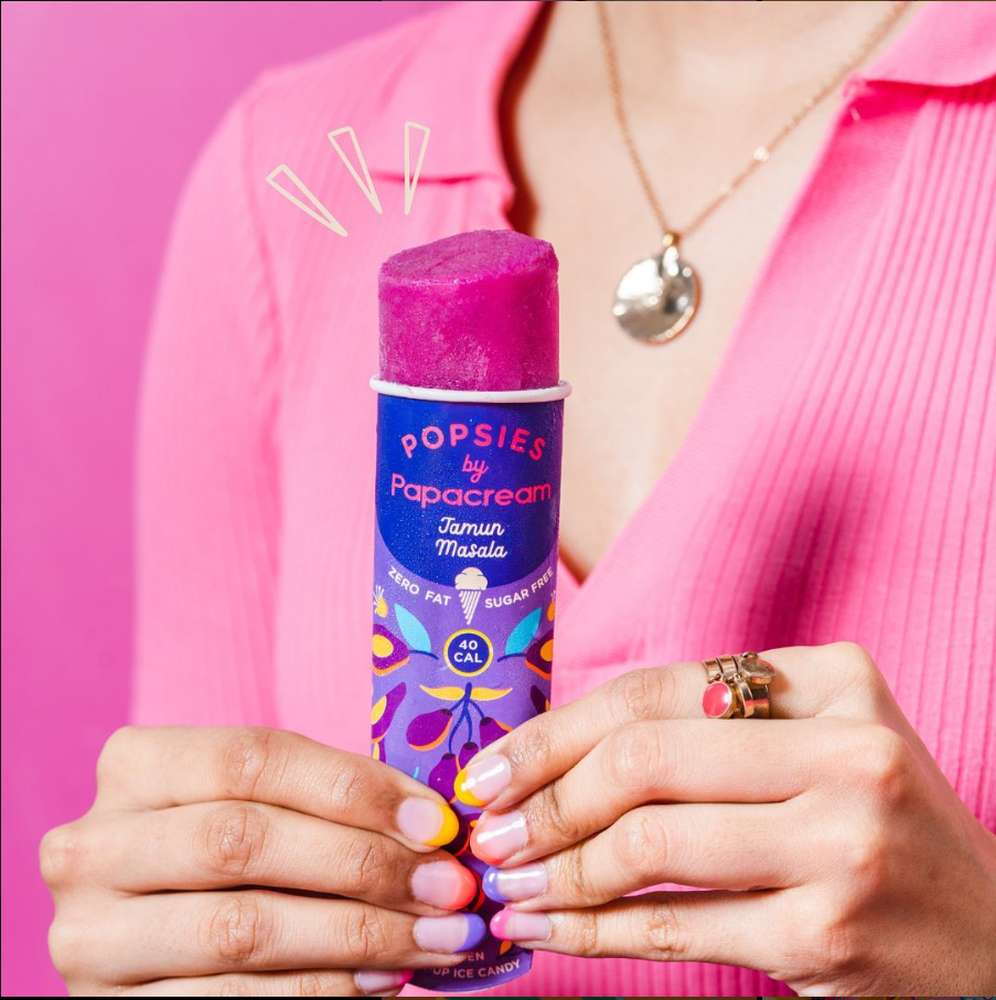
Papa Cream’s packaging is a standout in the world of ice cream. The brand’s tubs have a deliciously tempting appearance that surpasses all others. With its cool and vibrant colours, Papa Cream sets itself apart from the usual pastel and flower-themed packaging. Their packaging is so captivating that you’ll want to hold onto the box as a cherished memento from the brand. In fact, it’s easy to imagine creating your own personal collection of their beautifully designed tubs. Papa Cream’s packaging is truly a work of art, making each tub feel like a special addition to your ice cream experience. The brand’s attention to detail and artistic flair shine through in every package, elevating the overall enjoyment of their ice cream. With Papa Cream, the packaging becomes a delightful part of the ice cream journey, adding an extra element of excitement and anticipation.
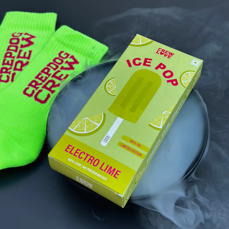
CrepDogCrew’s packaging design for their Ice Pops socks is clever and unique. The packaging features an image of an ice pop on the front, with the colour of the ice pops matching the socks inside. This playful and quirky approach grabs customers’ attention and creates a sense of curiosity about the product. The ice pop image adds a fun and lighthearted touch to the socks, making them appealing to a wide range of customers. The packaging also highlights the socks’ quality, mentioning that they are made of 100% cotton and preservative-free. Overall, CrepDogCrew’s packaging design showcases their creativity and stands out from traditional sock packaging, making the product more enticing to customers. It’s a great example of how unique and eye-catching packaging can make a brand and its products memorable.
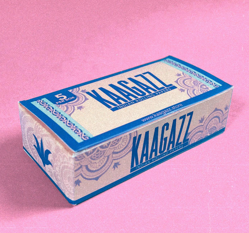
Kaagaz, the brand of rolling papers, is making waves in the Indian market. The name itself, meaning “paper” in Urdu, pays homage to India’s paper making heritage. What makes Kaagaz stand out is its exceptional branding and packaging. The design is minimalistic, exuding a sense of calm and tranquility. The packaging showcases various cultural elements from Indian culture, adding a touch of uniqueness. Kaagaz’s rolling papers are crafted with a perfect blend, promising to enhance your smoking experience. The brand’s packaging is sleek and visually appealing, capturing the attention of customers. It reflects the brand’s commitment to quality and attention to detail. Kaagaz’s packaging is a reflection of its Indian roots and heritage, appealing to both locals and international enthusiasts. It sets a new standard in rolling paper packaging, combining simplicity and cultural references. With Kaagaz, your rolling paper experience is elevated to a whole new level.
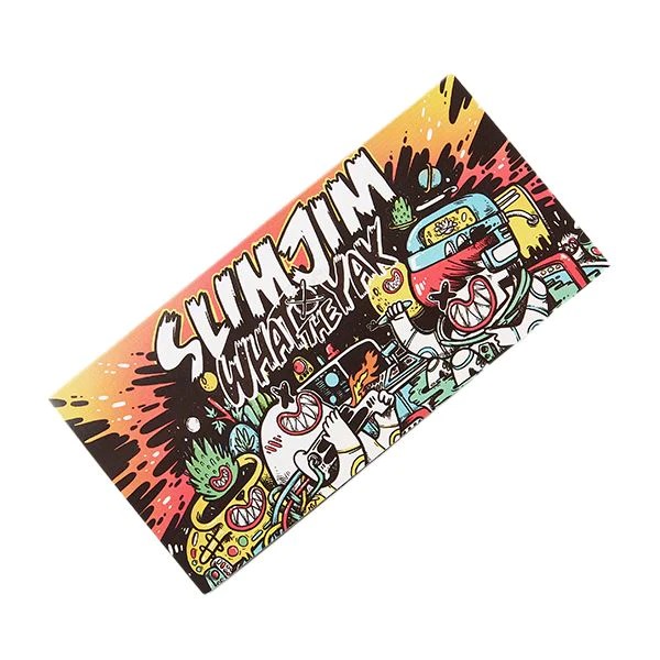
Slim Jim’s product packaging serves as a treasure trove of artistic inspiration. The Snail Paper design is particularly captivating for artists due to its combination of simplicity and complexity. The use of vibrant colours and basic shapes makes it easy for artists to recreate, while the intricate patterns and textures present endless opportunities for creativity. The packaging itself stands out with its wild and eccentric designs, catching the eye of consumers. It not only appeals to artists seeking inspiration but also provides visually appealing products for rolling needs. Slim Jim’s packaging is a visual feast that sparks imagination and artistic exploration. Artists can find endless joy in the packaging’s wacky and outrageous designs, making it a beloved source of artistic inspiration. The brand’s commitment to unique and attention-grabbing packaging adds an extra dimension of excitement and appeal. With Slim Jim’s packaging, artists and consumers alike can enjoy a visually stimulating experience.
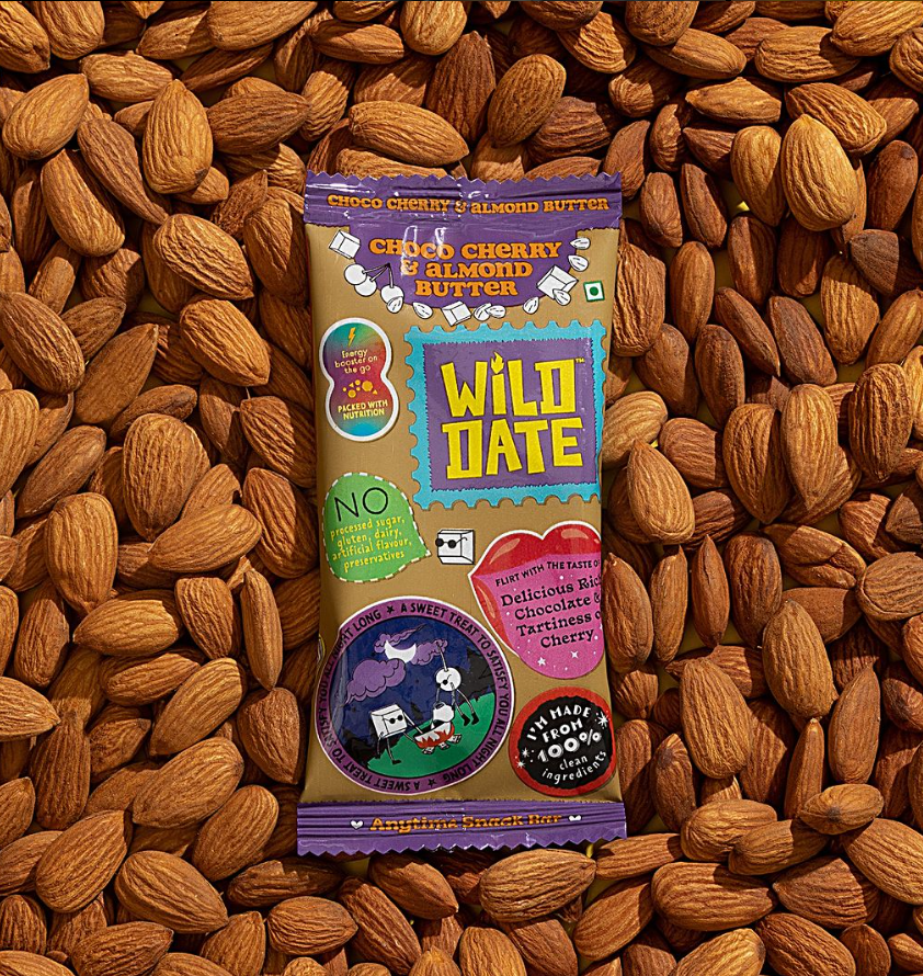
Wild Date’s packaging for their products is truly captivating. The brand has embraced a minimalistic and rustic design that perfectly complements the natural goodness of their date-based products. The packaging showcases the simplicity and elegance of wild dates, allowing the product to shine. The earthy colour palette and organic textures evoke a sense of authenticity and connection to nature. Each package is thoughtfully crafted to protect the quality and freshness of the dates, ensuring a delightful experience for consumers. Wild Date’s packaging not only reflects the brand’s commitment to sustainability but also creates a visual appeal that attracts customers. It stands out on the shelves, drawing attention to the natural and wholesome goodness within. The packaging becomes an extension of the brand’s values, offering a glimpse into the rich flavours and health benefits of their date products. Wild Date has truly mastered the art of packaging, making their products irresistible and inviting.
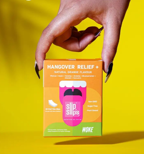
Woke nutrition is revolutionising the health and wellness industry with its vibrant and colourful packaging. Unlike the traditional beige and monotone designs, Woke nutrition adds a burst of pop colours that catch your attention and pique your curiosity. The brand incorporates the Gen-Z aesthetic, bringing a fresh and youthful vibe to the idea of wellness. The attractive packaging serves as a clickbait, enticing you to explore their products further. It stands out on the shelves, making it easy to spot and recognise. Woke nutrition’s packaging is not just visually appealing but also informative, providing a better understanding of their products. With their captivating colours and attractive packaging, Woke nutrition creates a delightful and engaging experience for consumers. It challenges the conventional notions of health and wellness, embracing a more vibrant and inclusive approach. Get ready to be drawn into the world of Woke nutrition as their packaging invites you to discover the exciting blend of style and wellness.

Chumbak is one of India’s pioneering brands that introduced us to a world of bohemian and quirky prints in design. During the early 2000s, owning a Chumbak accessory was a true trend among teenagers. The brand understood the importance of packaging and design in selling their products. Chumbak’s packaging played a crucial role in capturing customers’ attention and creating a strong brand identity. Their packaging designs were vibrant, eye-catching, and reflected the brand’s unique style. Chumbak’s packaging not only protected the products but also became a part of the overall experience. It added an extra layer of excitement and anticipation for customers. With their distinct and playful packaging, Chumbak successfully created a strong connection with their target audience. The brand’s commitment to innovative packaging design set them apart from their competitors. Chumbak’s packaging was a true reflection of their bohemian and quirky aesthetic, making it a must-have for fashion-forward individuals.
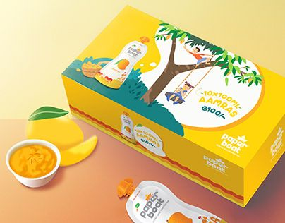
This beverage brand breaks stereotypes and barriers with its unique packaging design. The colourful and caricatured design language aims to capture the nostalgia of the target audience’s childhood memories. Every aspect of the packaging, from the back of the pack to the lining, is carefully crafted to enhance brand recall. The iconic Indian song “Woh Kagaz Ki Kashti Wo Barish Ka Pani” serves as a key inspiration, highlighting that this brand is not just another product or flavour, but an experience that evokes childhood nostalgia. The packaging system is designed to align with this fresh brand story and serves as a portal for establishing a strong brand connection and recall. The brand understands that packaging plays a vital role in creating a memorable and immersive experience for consumers. With its unique design, the packaging becomes an integral part of the brand’s identity and resonates with the target audience’s emotions and memories.
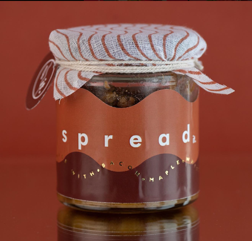
Spread’s packaging evokes the authenticity and nostalgia of a mother’s pickle jar, reminiscent of a college boy going back to his college after spending summers at home. The packaging design captures the essence of homemade goodness and care. The jars are packed in a way that reminds us of the love and attention put into preparing a meal at home. The packaging brings back memories of cherished moments and home-cooked meals, providing a comforting and familiar experience. Spread understands the emotional connection between food and memories, and their packaging reflects this sentiment. Each jar is carefully packaged to ensure freshness and to preserve the homemade flavour. The brand’s packaging design transports us back to the warmth and love of a mother’s kitchen, making it more than just a jar of spread. It becomes a cherished reminder of home and family. Spread’s packaging is a testament to their commitment to quality and authenticity, creating a connection between the consumer and the brand.
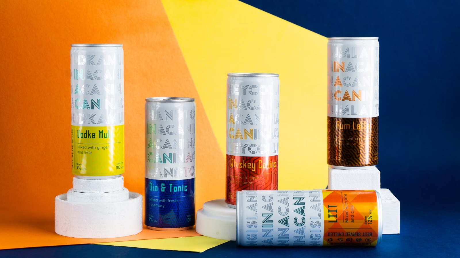
InACan’s cocktail drinks packaging is a game-changer. The sleek cans are visually appealing and easy to hold. They come in vibrant colours like Red,Blue,Yellow, Brown and Orange and flavours. The design combines elegance with a modern twist. Opening the cans is simple. The cocktails stay fresh and flavourful until the last sip. InACan has made enjoying cocktails convenient and stylish. The packaging is perfect for on-the-go or social gatherings. It reflects the brand’s commitment to quality and taste. InACan has transformed the cocktail experience with their innovative packaging. They deliver premium cocktails in a practical and visually appealing format. Cheers to InACan for revolutionising cocktail enjoyment!.
In a world where first impressions matter, quirky packaging emerges as a delightful and captivating trend. With its ability to surprise, engage, and leave a lasting impression, this unconventional approach to design adds an extra layer of excitement to the consumer experience. From whimsical shapes and vibrant colours to unexpected materials and clever functionalities, quirky packaging showcases the power of creativity in capturing attention and fostering a deeper connection between brands and their audience. As we celebrate the fusion of artistry and practicality, let us embrace the endless possibilities that lie within these extraordinary packages, inviting us to explore, engage, and appreciate the beauty of design in our everyday lives.