Sip in Style: Exploring the Art of Beverage Branding!
In a nation with a rich culinary heritage and diverse tastes, the beverage industry in India has flourished and thrived. Behind the success of these beverage brands lies an artful blend of product quality, marketing strategies, and compelling branding. This blog delves into the world of Indian beverage brands, uncovering exploring the secrets and formulas behind their branding triumphs.
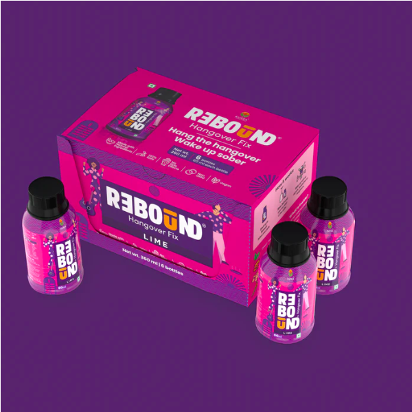
Rebound Drink boasts an exceptional and distinctive packaging design, characterized by vibrant colours like purple and pink. The product features creative and captivating illustrations on the packaging, with a catchy tagline, “the last shot you drink,” which effectively captures the attention of prospective consumers.
The design is further accentuated by the presence of people on the bottle, exhibiting their revitalized state after a night of alcohol consumption, as well as a guitar, which signifies a fun-filled night of entertainment.
In summary, Rebound Lime’s packaging design is a standout in the market, leveraging the power of colour, illustration, and tagline to attract and engage customers. This innovative design sets it apart from competitors, while effectively conveying its refreshing and re-energizing benefits.
2. Doja Gin
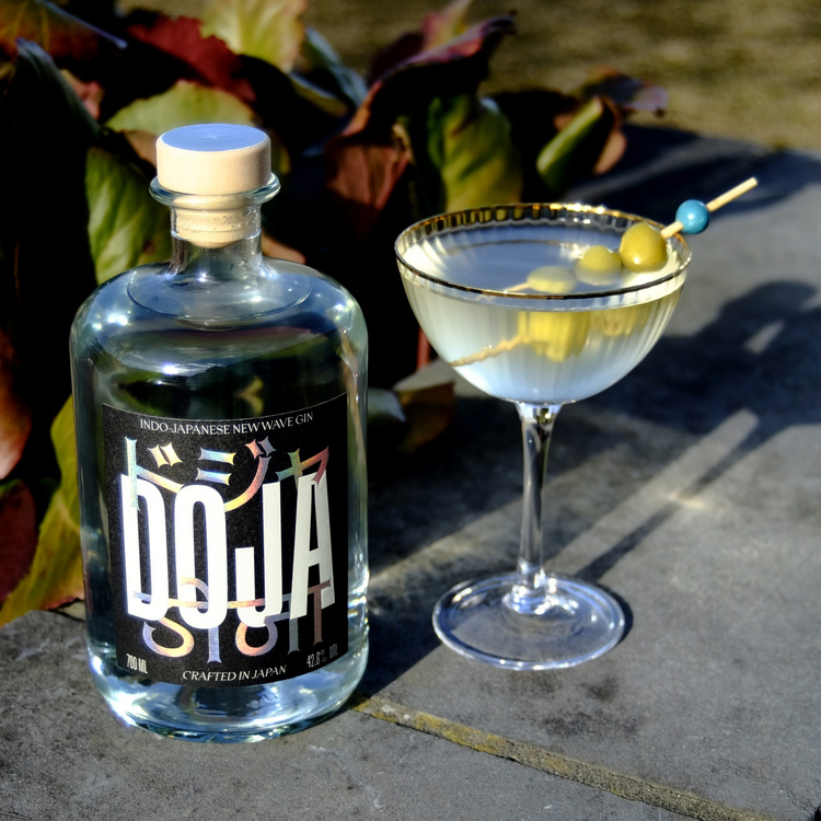
Doja Drinks, an Indo-Japanese gin brand, boasts a packaging design that uniquely highlights its cultural heritage. The packaging eloquently portrays the brand’s message of being a fusion of Indian and Japanese cultures innovatively and artistically.
The packaging features the brand name “Doja” written in English at the centre, overlapped by the Japanese version of “Doja” above it, and the Hindi version of “Doja” at the bottom. This elegant trifecta beautifully showcases the merger of Indian and Japanese cultures, making it a standout product in the market.
The packaging design is both quirky and sophisticated, setting it apart from other gin brands in the market. The use of multiple languages on the packaging is a smart way to emphasize the brand’s unique cultural heritage, attracting consumers who seek something different and exciting.
Overall, Doja Drinks’ packaging design is a testament to the brand’s commitment to celebrating the fusion of Indian and Japanese cultures. The design is visually appealing, and informative, and effectively conveys the brand’s unique selling proposition. This standout product offers consumers a distinctive experience, both in terms of taste and packaging design.
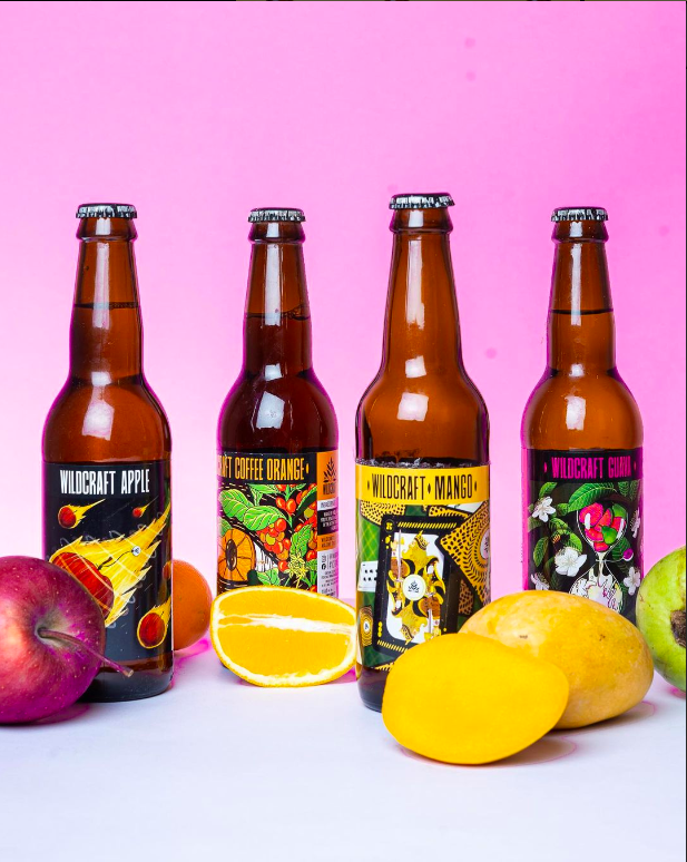
Wildcraft Beverage’s branding and packaging are designed to be both eye-catching and informative. The use of bright colours and bold graphics makes the products stand out on the shelf, while the informative text on the labels tells consumers what they can expect from the product. The overall design of the packaging is consistent across all of the products, which helps to create a strong brand identity.
The apple cider label features an apple encased in fire, which is a reference to the fact that the cider is made with apples that have been roasted over an open fire. The mango cider label features a mango on a deck of cards, which is a playful way to represent the tropical flavour of the cider. The coffee orange cider label features an orange in the centre, along with a coffee bean in the centre of the orange to signify the fusion between these. The guava cider label features guavas inside an hourglass, which is a visual representation of the refreshing taste of the cider.
The use of new age and fun graphics helps to make Wildcraft Beverage’s products stand out from the competition. The labels are eye-catching and memorable, and they help to convey the brand’s message of being a fun and exciting company that makes great-tasting beverages.
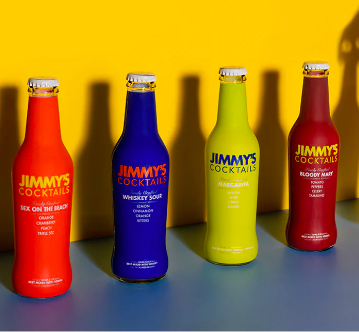
Jimmy’s Cocktails is a premium low-calorie cocktail mixer brand originally designed to support India’s leading bars and clubs. The brand is now available to consumers in India, and it offers a variety of flavours that can be mixed with your favourite spirit to create delicious cocktails at home.
Jimmy’s Cocktails is known for its high-quality ingredients and its commitment to using natural sweeteners.
Jimmy’s Cocktails is packaged in a sleek and modern design that reflects the brand’s premium quality. They use bottles with extremely vibrant labels and packaging that makes them stand out in the crowded beverage industry, due to the vibrancy used on their packaging you can see that it would be a product that would stand out on a shelf stacked with other mass beverage companies.
With their name and branding, it is very evident that it wants to be showcased as a premium cocktail mix but they also want to incorporate the fun of consuming a tasty cocktail through the use of vibrant colours.
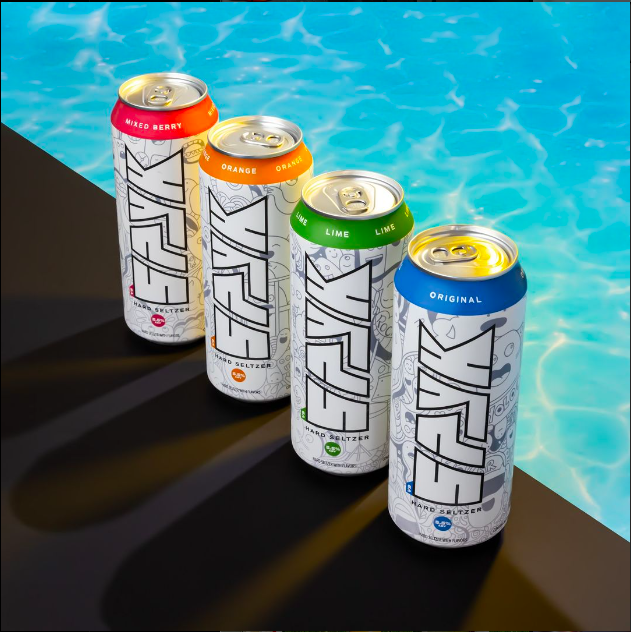
Spyk Hard Seltzer is a brand of hard seltzer that is made in India. Spyk Hard Seltzer is made with carbonated water, natural flavours, and alcohol. It is a low-calorie, low-carb beverage that is perfect for those who are looking for a refreshing and flavorful drink.
The Spyk Hard Seltzer branding is modern and stylish. The brand’s logo is a simple black-and-white design that features the word “Spyk” in a bold font. The packaging for Spyk Hard Seltzer is also modern and stylish. The labels are clean and minimalistic.
They also come in two different packaging styles which suits its consumers the best, as they are targeting a healthier way to get the same buzz that you get from a beer while consuming fewer calories and avoiding the infamous beer belly, their way to convey this is marvellous and its bottle and can style lets the habit of regular beer drinkers stay consistent by giving them the sense of drinking out of a similar bottle or can that they would consume their beer in.
6. Jade Forest
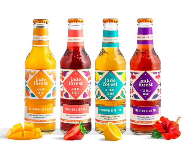
Jade Forest’s branding is inspired by the natural beauty of India. The name “Jade Forest” evokes images of a lush, green forest, and the logo features a green jade forest with a white lotus flower in the centre.
The packaging is simple and modern, with clear bottles and clean labels. The images used in the packaging feature the original ingredients of the flavour and the forest. The images are visually appealing and they help to create a sense of place in the packaging design.
Jade Forest’s beverages are also thoughtfully crafted. The company takes pride in using only the highest quality ingredients and in crafting each beverage to perfection. The beverages are made with care and attention to detail and that is what they want to showcase with its branding and packaging. Their main tagline is “Thoughtfully crafted drinks” showcasing all of the above elements that they want to convey through their packaging with this tagline
Jade Forest’s beverages are a great way to enjoy the natural beauty of India and experience the company’s commitment to quality and craftsmanship.
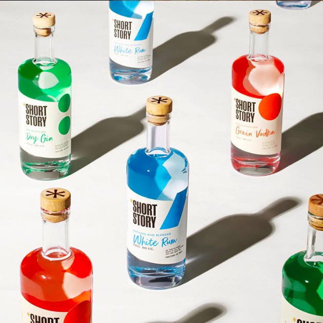
ShortStorySpirits is a brand of craft spirits that is based in India. The brand is known for its unique flavours and its stylish packaging.
ShortStorySpirits’ brand story is “Keeping our stories short to let our spirits do the talking” which is a clever way to communicate the brand’s message. The tagline is short, catchy, and easy to remember. It also helps to differentiate the brand from its competitors.
The tagline is a reference to the fact that ShortStorySpirits spirits are made with high-quality ingredients and are not mass-produced. The spirits are allowed to speak for themselves, without the need for flashy marketing or gimmicks. This helps position ShortStorySpirits as a premium brand committed to quality.
The ShortStorySpirits branding and packaging are effective in communicating the brand’s message. The brand is known for its unique flavours and its stylish packaging. The branding and packaging help to create a sense of luxury and sophistication for the brand.
“No potatoes just vodka” – The tagline helps to position ShortStorySpirits as a premium vodka that is made with high-quality ingredients
This is a unique selling point for the brand, as most vodkas are made with potatoes.
“No pirates just rum” This is a fun take on the consumption of rum which is usually consumed a lot by pirates and most rum brands have elements of ships and pirates, whereas Short Story has decided to ditch the overused elements and maintain the elegance and quirkiness of its packaging throughout all its variants.
“No jargon just gin” is a reference to the fact that ShortStorySpirits gin does not want to promote its liquor with the help of various jargon used by other brands that emphasize the botanical methods and origin of their gin. This is yet another unique selling point for the brand, as most gins are marketed as made with botanical methods from different parts of the world. Short Story chooses to ditch the norm of other Gin brands and wants to showcase its carefully crafted product without any jargon.
8. Malaki
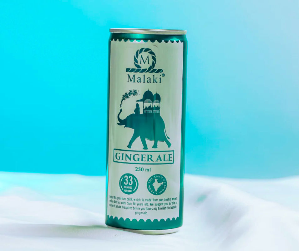
Malaki is a Hindi word meaning “great” or “magnificent.” The name was chosen to reflect the quality and craftsmanship of the Malaki products. The name is also a way to connect with the Indian subcontinent, where the products are made.
The name Malaki is a good fit for the brand because it is unique, memorable, and relevant to the product. The name is also a way to connect with the Indian subcontinent, where the products are made.
The tagline is positive and inspiring. It is a reminder to live life to the fullest and to let your inner light shine through. This is a message that is likely to appeal to the target audience for sparkling water, which is typically young, active, and health-conscious people.
Sparkling water is a refreshing beverage that is often associated with fun and excitement. The tagline “Don’t stay still, sparkle” captures this feeling and helps to position sparkling water as a beverage that can help people to live their lives to the fullest.
India is one of the world’s largest producers of ginger. The ginger grown in India is known for its high quality and its unique flavour. This is highlighted well that this is a brand that takes heritage in the rich history of India and conveys that through its effective packaging on the Ginger Ale can that represents an elephant on the packaging and likely a way to connect the brand to India and its rich culture.
The use of pink flowers and a mountain on the sparkling water packaging is likely a reference to the fact that the sparkling water is sourced from the Himalayas. The Himalayas are a mountain range that is located in the northern part of India. The mountains are home to a variety of plants and flowers, including pink flowers.
9. Guppy Moms
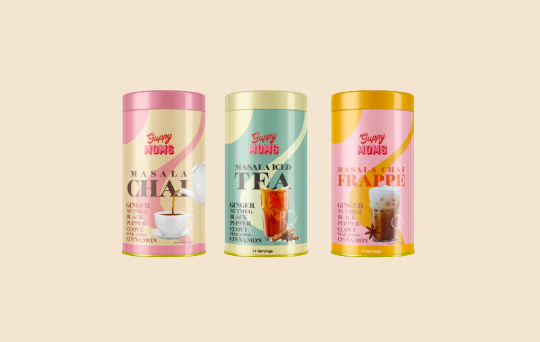
Guppy Moms is a brand of Indian masala chai that is sold online. The brand’s branding, brand language, and packaging all work together to create a warm and inviting image that is consistent with the brand’s mission to bring the essence of motherly love and warmth to every sip of tea.
Guppy Moms uses vibrant, warm colours, such as light pink, on their packaging. They also feature a large illustration of masala chai being poured into a cup. The ingredients, such as ginger, nutmeg, black pepper, clove, star anise, and cinnamon, are highlighted clearly on the packaging, even though the colours are vibrant and appealing.
The use of vibrant colours helps to make the brand stand out. The illustration of masala chai being poured into a cup creates a sense of warmth and cosiness. The highlighting of the ingredients helps customers to understand what they are getting, and it also adds a sense of authenticity to the brand.
Overall, Guppy Moms does a great job with their branding and packaging. The brand has created a warm and inviting image that is consistent with its mission, and it has done so in a way that is both visually appealing and informative.
10. Drink Sober
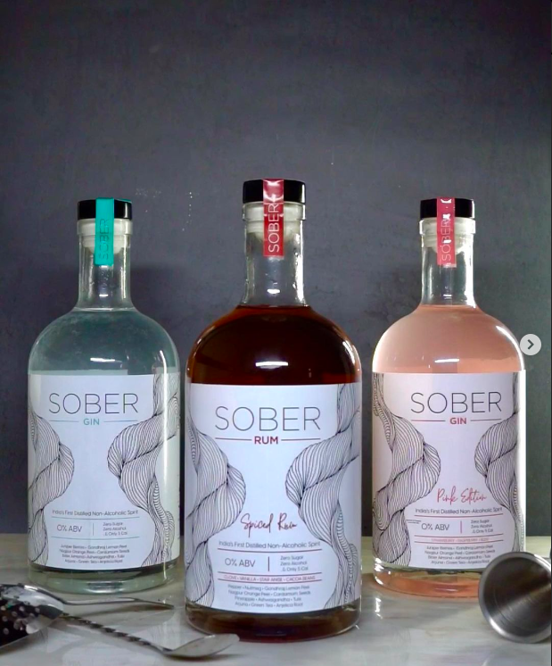
Sober is a brand that is trying to create a non-alcoholic beverage that can provide the same experience as drinking alcohol, without the negative side effects. Their branding is very clean and minimalist, and it comes off as a brand that is delivering the alcohol experience without harming your body.
Sober’s claims that their drinks can uplift mood, boost immunity, relieve stress, and relieve anxiety are all interesting.
The brand’s logo is a simple, yet elegant design that features the word “SOBER” in a modern font. The logo is used on all of the brand’s marketing materials, including the website, social media, and packaging.
The brand’s packaging is also very clean and minimalist. The bottles are made of high-quality glass and feature the brand’s logo and colours. The bottles also include a short description of the beverage and a list of the ingredients.
Sober’s branding and packaging are both very consistent with the brand’s mission to provide a premium non-alcoholic beverage. The clean and minimalist design of the brand’s logo and packaging helps to create a sense of luxury and exclusivity. This is a great way to appeal to the target market of Sober, which is people who are looking for a high-quality non-alcoholic beverage.
11. Borecha
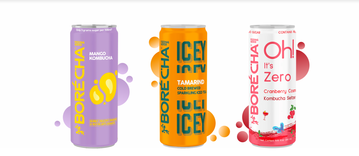
Borecha’s branding and packaging are both very vibrant and colourful. The brand’s logo is a simple, yet effective design that features the word “Borecha” in a modern font. The logo is used on all of the brand’s marketing materials, including the website, social media, and packaging.
The brand’s packaging is also very vibrant and colourful. The cans also include a short description of the beverage and a list of the ingredients.
Borecha’s branding and packaging are both very consistent with the brand’s mission to provide a healthy and refreshing beverage. The vibrant colours of the logo and packaging help to create a sense of energy and excitement. This is a great way to appeal to the target market of Borecha, which is people who are looking for a healthy and refreshing beverage.
12. Segredo Aldeia
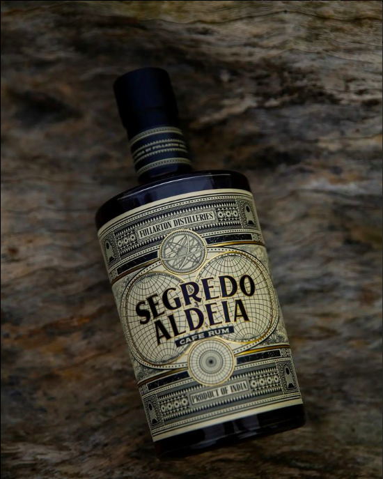
Segredo Aldeia’s branding and packaging are both very unique and eye-catching. The bottle features a very ancient-looking yet modern design that is consistent with the brand’s mission to provide a premium rum. The illustrations of the globe on the packaging showcase the rich history of the rum, and the linework and patterns add a touch of sophistication.
The brand’s logo is a simple, yet effective design that features the word “Segredo” in a modern font. The logo is used on all of the brand’s marketing materials, including the website, social media, and packaging.
The brand’s name means “The Secret Village,” and it is a great way to communicate the brand’s story and to create a sense of mystery and intrigue. The tagline also helps to connect with the brand’s target market, which is people who are looking for a premium rum with a unique story.
Overall, Segredo Aldeia’s branding and packaging are very effective. The brand has done a great job of creating a premium and sophisticated image that is consistent with its mission to provide premium rum.